1. Know the advantages and disadvantages of frequency distributions and graphs compared to statistics to describe distributions.
Tables and graphs are good for quick, overview of distributions (frequency distributions) and serves as visual comparison of many distributions. They are especially useful to evaluate the shape of a distributions.
Statistics are better than graphs in providing specific parametric characteristics of distributions such as central tendency (e.g. Mean) and variability (e.g. Standard deviations).
2. Know the advantages and disadvantages of grouping and situations when grouping may be helpful.
The primary use of grouping data is for making graphs or table summaries.
Grouping (graphs or tables summaries) of data allows key characteristics of the data to be more easily interpreted or presented (a picture is worth a thousand words principle) than would be true if the raw data especially if large would be presented.
Grouping does not result in as much loss of detail as would describing groups with a single statistical parameter such as the mean.
Grouping or statistical parameters does results in loss of precision.
3. Know the characteristics of common
charts or graphs for summarizing data.
| Frequency Polygon | Bar Chart | Histogram | Pie Chart |
| Scatterplot | Mixed Chart | Stem and Leaf | Box Plot |
4. Know the basic principles for proper construction of charts and graphs.
The number of class intervals should be between 5 and 20
The class width can be determined by:
![]()
The ratio of the vertical axis to that of the horizontal axis should be such that the vertical axis (Y) is ¾ the length of the horizontal axis.
The location of the zero value for the vertical axis must be
clear indicated (by a broken axis if necessary). Otherwise it is called
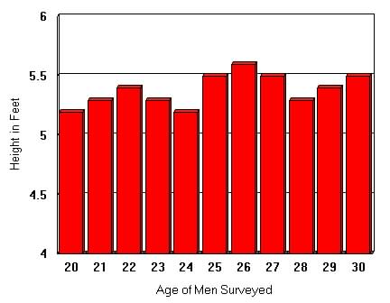
a truncated chart. Figure 2b.1a shows a truncated chart where
the zero point of the y-axis in not clearly shown. Truncated graphs often
are misleading.
| Figure 2b.1a Truncated chart
(Height of men in feet between 20 to 35 years old - note that height starts
at 4 instead of 0)
|
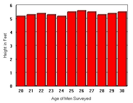
Figure 2b.1b Non-Truncated chart
(Height of men in feet between 20 to 35 years old - note that height starts
at 0)
|
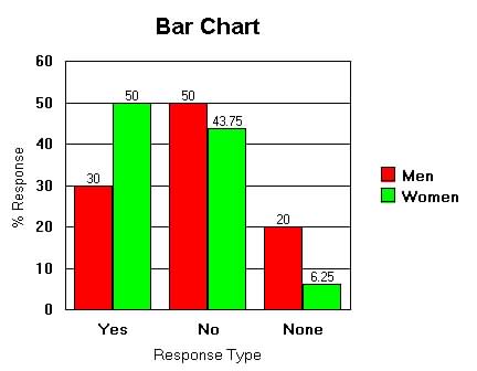
5. Know how to compare the shapes of two distributions with different samples sizes on the same axis.
To compare the shapes of two distributions with different sample sizes on the same axis it is necessary to use percentage as the vertical axis.
Example: A survey of the opinions of 50 men and 80 women on an
issue with Yes, No or None response is tabulated and graphed below for
comparison
.
| Table 2b.2 Response of Women
and Men
Sample size for Men is 50 and Women is 80
Percent is used for comparison |
 |
6. Know the shape
of the following types of distributions, circumstances when each occur,
and recognize examples of variables that would result in each shape:
| Positively skewed | Negatively skewed | J-shaped | Bimodal |
| U-Shaped | Normal | Rectangular | Symmetrical |
Figure 2b.3 Normal Distribution
|
|
Bell-shaped curve
(Asymmetrical shape) Most random events or processes Average Height
|
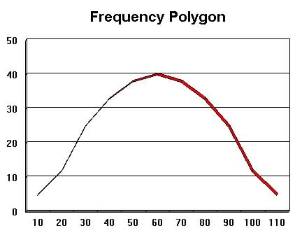 |
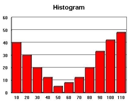
Figure 2b.4 Positively Skewed
(skewed to the right)
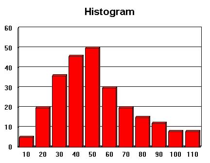 |
Non-symmetrical curve
Longer right tail (few high values) Frequency bunched to left (low values) Income, Salary Levels
|
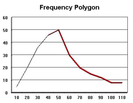 |
Figure 2b.5 Negatively Skewed (skewed
to the left)
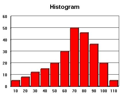 |
Non-symmetrical curve
Longer left tail (few low values) Frequency bunched to right (high values) Fuel Consumption at various speeds
|
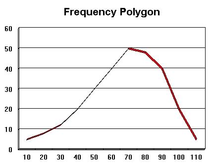 |
Figure 2b.6 J-shaped curves (Exponential)
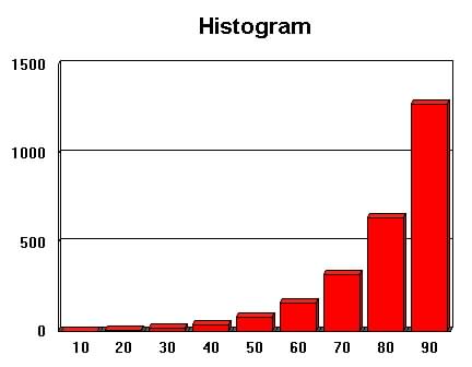 |
Extremely skewed curves
(exponential curves) Highest point at left or right extremes Fast growth or decay rates Automobile depreciation
|
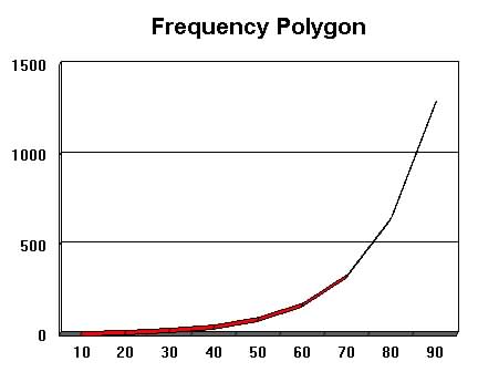 |
Figure 2b.7 Bimodal Distribution
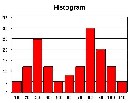 |
Two high point separated by low
points
(points not equally high) Two different homogeneous characteristics mixed together
Average Heights of women and men mixed together
|
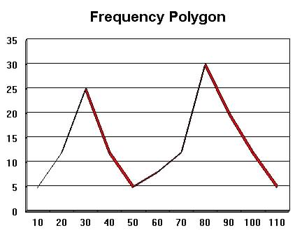 |
Figure 2b.8 U-shaped distribution
 |
An extreme bimodal distribution
where the two modes are at the extremes points (high and low values)
Extreme views or extremely polarized groups. Attitudes toward abortions
|
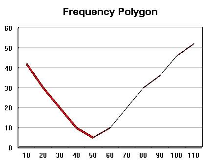 |
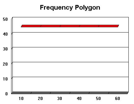
Figure 2b.8 Rectangular
(Uniform) Distribution
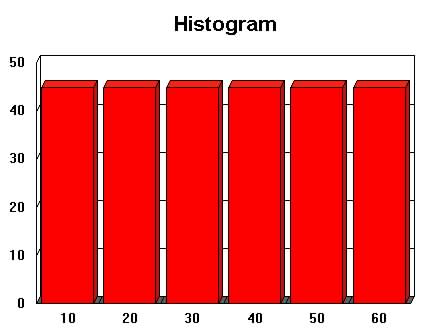 |
Equal Frequencies at each point
Each value randomly determined Frequency of values on a fair die
|
 |